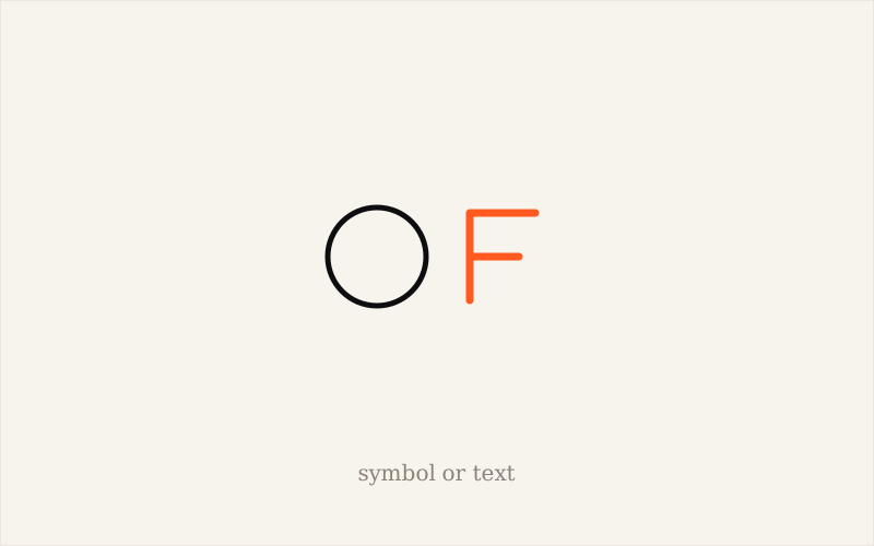
The "with or without a symbol" debate comes up in almost every project. There is no universal right answer: it depends on your name, the materials the logo will live on, and how long you have to build your reputation.
The three options at a glance
- The wordmark: the name, drawn with care. A famous example is Coca-Cola, whose history shows the strength of a consistent lettering.
- The symbol alone: a shape that stands on its own, like Nike's swoosh. It takes a great reputation to be understood without the name. See the history of the Nike logo.
- The combination: a symbol and a name, usable together or apart. It is the most common formula for mid-sized businesses.
When to choose a wordmark
- When the name is short and distinctive.
- When the business is starting out and needs people to remember its name above all.
- When the budget calls for simplicity: just one element to get right.
- When the logo must stay legible on every material, without depending on a drawing.
When to add a symbol
- For square or round formats: social media avatar, favicon, app icon. See a logo for Instagram (in French) and logo and mobile app icon (in French).
- When the name is long or hard to read small.
- For embroidery, marking or packaging, where a mark alone is enough.
- When a strong idea deserves to be carried by a sign.
The combination, the most flexible choice
A logo made of a symbol and a name gives you several versions: horizontal, vertical, symbol alone for small formats. That is the logic explained in should you create several versions of your logo (in French) and in a logo that stays legible at small sizes (in French). The monogram (one or two letters) is an in-between variant: see letter and monogram logos (in French).
Frequently asked questions about choosing between symbol and text
Is a logo without a symbol less professional?
No. A well-drawn wordmark can be very professional and very durable. What counts is the quality of the drawing and the legibility, not the presence of a symbol.
Can you add a symbol later?
Yes, if the wordmark was designed with that in mind. It is better to plan for it from the start, to keep the two versions consistent.
More questions about logo design
What Is a Logo and What Is It Really For in a Business?
A logo is the graphic sign that identifies a business: it helps people recognise it, tells it apart and reassures. Read the article →
Is a Logo Required to Start a Business?
No law requires a logo to start a business: it is useful to reassure and identify, but not compulsory. Read the article →
When Should You Create Your Logo: Before or After Launching Your Business?
Create your logo once the business and name are defined, and before your first public materials (sign, website, quotes). Read the article →
Does a Logo Have to Represent What the Business Does?
Not necessarily: a logo should make the business recognisable, not draw its trade. Read the article →
What Are the Key Elements of a Professional, Memorable Logo?
A good logo combines five qualities: simple, memorable, timeless, versatile and relevant to the business. Read the article →
What Common Mistakes Should Be Avoided When Creating a Logo?
The most frequent mistakes: unnecessary complexity, lack of originality, poor readability at small sizes, and no vector files. Read the article →
How Can a Logo Strengthen a Small Business's Brand Image?
A good logo gives a small business instant credibility and consistency across all its materials, often before the first customer contact. Read the article →
See all questions about logo design →
My take as a designer
For a business starting out, I often advise getting the wordmark right first: the name is what people remember first. The symbol can come later if it has a real reason to exist, for example for the avatar or the shop sign.
A symbol with no reason to exist adds nothing; a well-drawn name is often enough.
To sum up
Wordmark, symbol or combination: all three work, depending on your name, your materials and your reputation.
The wordmark is the safest choice to start with; the symbol becomes useful for small formats and materials without text.
The combination offers the most flexibility, provided each version is planned from the design stage.