October 12, 2026
ArtCraft: Free Alternatives to Adobe, and What They're Worth to a Designer
Twelve free, open-source apps modelled on Adobe's software: what they're worth to a designer today.
Read the article →Blog
Thoughts on logo design, visual identity and the craft of freelance design — written by Vincent, straight to the point, no jargon.
Twelve free, open-source apps modelled on Adobe's software: what they're worth to a designer today.
Read the article →
VectorCraft, the free open-source alternative to Illustrator: a designer's test, its limits and how to try it without risk.
Read the article →
PhotoCraft, the free open-source alternative to Photoshop: its features, its early-alpha status and what you can do with it today.
Read the article →
The 38 most-asked questions about logo design, with a short answer and a link to the full article.
Read the article →
The visual codes by sector, when to depart from them deliberately, and a simple method for choosing.
Read the article →
The list of formats to ask for with a logo, what each is for and a summary table by use.
Read the article →
Five signs of a dated logo, how to check objectively, and why following every trend is risky.
Read the article →
Eight frequent mistakes in logo creation, why they're a problem and how to avoid them.
Read the article →
How a logo strengthens a small business's credibility, consistency and memorability, and what it can't do alone.
Read the article →
Shapes, colours and codes recommended by each health and wellness specialty, and the pitfalls to avoid.
Read the article →
Recognition indicators, a before/after method and a realistic timeframe to judge a new logo's effect.
Read the article →
One to three colours in practice: why limit the palette, how to balance it and which versions to plan.
Read the article →
A tagline in the logo? Why it is often a bad idea at small sizes, and the two-version solution.
Read the article →
A gradient in a logo? What it brings, the difficulties in print and the rule of the flat logo first.
Read the article →
The five-second test, mock-ups, who to ask: a simple method to test a logo.
Read the article →
Hand sketches then vector drawing: why this step changes a logo's quality, even if you can't draw.
Read the article →
Copyright, assignment of rights and clauses to check: who owns a logo, under French law.
Read the article →
Image search, trademark databases, domain names: five checks to make sure a logo doesn't already exist.
Read the article →
Free isn't open: font licences, the particular case of a logo and why to customise the lettering.
Read the article →
Inspiration or copying? Where the line lies, the legal and commercial risks, and how to take inspiration properly.
Read the article →
Re-read the quote, ask in writing, remedies and a fallback: what to do if the source files aren't delivered.
Read the article →
Graphic designer, designer, art director: each role, and the profile to choose to create a logo.
Read the article →
A reading grid to compare several logo quotes: deliverables, revisions, rights, deadlines, payment.
Read the article →
One or several routes, two to three rounds of revisions: how to find your way and make the most of your revisions.
Read the article →
Name what bothers you, re-read the brief, use your revisions, then the remedies: what to do if the logo doesn't suit you.
Read the article →
The advantages and risks of a logo made by a friend, what a professional brings and how to set a framework.
Read the article →
Files to supply, placement, minimum size, print colours: using your logo on a business card and stationery.
Read the article →
SVG or PNG, size, mobile version, favicon, alt text: best practice for adding your logo to a website.
Read the article →
Screen printing, embroidery, engraving: each process's constraints and the files to supply to print your logo.
Read the article →
Versions, clear space, minimum size, forbidden uses: what logo usage guidelines contain.
Read the article →
Inventory, priorities, transition period, old stock: what to do with old materials when you change your logo.
Read the article →
Simplicity, app icon, dark background, pitfalls to avoid: the principles of a startup's or tech company's logo.
Read the article →
Trust, restraint, ethics rules, typical materials: the principles of a logo for a professional practice.
Read the article →
Square artwork, legibility as a thumbnail, mascot or monogram, consistency: a podcast or content creator's logo.
Read the article →
Credibility, official documents, crest or modern symbol, label logos not to imitate: a school's or training body's logo.
Read the article →
Authenticity, labels, direct sales, official labels not to imitate: a local producer's or farm's logo.
Read the article →
A definition of a logo, its three forms, what it does for a business and what it can't do on its own.
Read the article →
No law requires a logo to start a business: what is required, what is useful, and when to deal with it.
Read the article →
Before or after launch? What to define first, when to start early and when you can wait.
Read the article →
Show the activity, or not? The three approaches, when being literal helps and when it boxes you in.
Read the article →
Wordmark, symbol or combination: the advantages of each option and the criteria for choosing.
Read the article →
A logo isn't your whole brand. The concrete difference between logo and branding, with examples.
Read the article →
Refreshing your branding doesn't mean tearing everything down. Practical advice for improving a brand.
Read the article →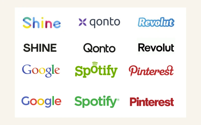
Google, Spotify, Pinterest, Revolut, Qonto, Shine: the date of every redesign, and why flattening everything makes brands blend together.
Read the article →
The key elements of a professional, memorable logo, explained one by one.
Read the article →
Readability, simplicity, memorability, consistency, originality, versatility: the concrete criteria for judging a logo.
Read the article →
3D effects, excessive gradients, too many fonts: the most common mistakes that give away a poorly designed logo.
Read the article →
From brief to final delivery, the 7 steps that really make up professional logo design.
Read the article →
Beyond colours and shapes, typography plays a key role in a logo's identity.
Read the article →
The benefits of a monochrome logo: recognition, ease of use, consistency across every medium.
Read the article →
What a logo's geometric shapes communicate unconsciously: roundness, stability, momentum.
Read the article →
Blue, red, green, orange... every colour sends a message before your name is even read.
Read the article →
Why has the Coca-Cola logo stayed recognisable for over a century?
Read the article →
Adidas's three stripes were first designed for sports performance, long before becoming a brand symbol.
Read the article →
McDonald's golden arches originally came from the very architecture of its first restaurants.
Read the article →
From the rainbow apple to today's monochrome silhouette: the story of the Apple logo.
Read the article →
How Nike's Swoosh, drawn for $35 by a student in 1971, became one of the most recognisable logos in the world.
Read the article →
Logo, visual identity, brand: the concrete difference between these terms.
Read the article →
Should you go for a clean logo or one rich in detail? The concrete criteria for choosing.
Read the article →