A well-drawn logo only stays well drawn if it is well used. As soon as several people use it (team, printer, partners, journalists), small distortions pile up: a logo stretched to "fit" in a box, approximate colours, an impossible background. Logo usage guidelines are there to prevent them.
What it contains
- The versions of the logo: main, horizontal, vertical, symbol alone, one colour, dark background.
- The clear space: the free area to keep around the logo.
- The minimum size, in print and on screen.
- The colours, with their reference codes for screen and print.
- The permitted backgrounds: on which backgrounds, with which version.
- The forbidden uses: distorting, recolouring, adding effects, placing on a busy background.
- The associated typefaces, when they are part of the identity.
The clear space
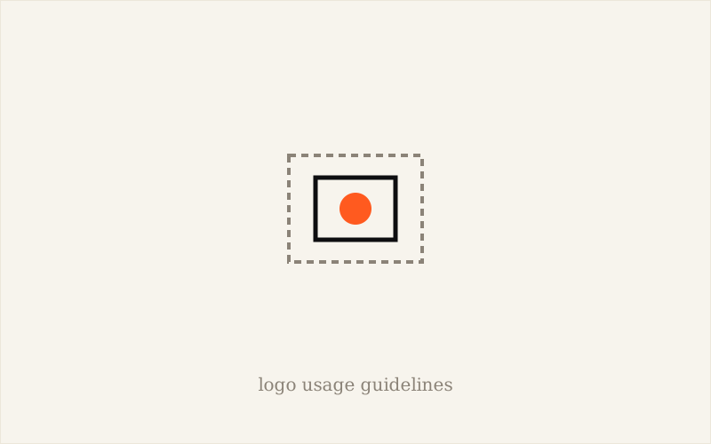
It is the empty area to respect around the logo: no text, no image, no edge should enter it. It is often defined from an element of the logo (for example the height of a letter) so that it adapts to every size. Without it, the logo ends up pressed against other elements and loses legibility.
The minimum size
Below a certain size, the logo becomes illegible or loses its details. The guidelines give the minimum width in print (in millimetres) and on screen (in pixels), and say when to switch to a simplified version. See how to create a logo that stays legible at small sizes (in French).
The forbidden uses
- Stretching or compressing the logo.
- Changing its colours outside the versions provided.
- Adding shadows, outlines or effects.
- Placing it on a background that reduces its legibility.
- Changing the layout of the elements or the typeface.
What it's for, in practice
Usage guidelines let you pass the logo to a printer, a partner, a journalist or a new colleague without a verbal explanation, and get a faithful result. They save time every time the logo is used by someone other than you.
Do you need guidelines when you're small?
Yes, in a lighter form: one or two pages with the versions, clear space, minimum size, colours and three or four no-nos are plenty. To go further, see brand guidelines: what are they really for (in French) and why brand guidelines are essential (in French).
Frequently asked questions about logo usage guidelines
Are logo usage guidelines the same as brand guidelines?
Logo usage guidelines are part of brand guidelines. The latter are wider: colours, typefaces, image style, tone, layouts.
How long should logo usage guidelines be?
For a small business, one or two pages are enough: versions, clear space, minimum sizes, colours, forbidden uses.
More questions about logo design
How Do You Use Your Logo on a Business Card and Company Stationery?
Supply a vector file, place the logo consistently with a margin, and check size and colours on a printed test. Read the article →
How Do You Add Your Logo to Your Website?
Favour SVG, with a transparent PNG as backup, a mobile version and a favicon, and add alt text. Read the article →
How Do You Get Your Logo Printed on Clothing or Objects?
Each process has its constraints: start from a vector file and a simplified version, then approve a proof before production. Read the article →
What Should You Do With Old Materials When You Change Your Logo?
Take stock of your materials, change digital on launch day and print as it's renewed, limiting how long the two logos coexist. Read the article →
What File Formats Should I Request for a Logo So I Can Use It Across Different Materials?
A professional logo should be delivered as a vector file (SVG, PDF, EPS) for print, plus PNG and JPG exports for the web. Read the article →
How Do I Measure the Impact of a New Logo on My Brand's Recognition?
A new logo's impact is measured through recognition, perception and indirect signals, observed over 3 to 6 months. Read the article →
What Are the Key Elements of a Professional, Memorable Logo?
A good logo combines five qualities: simple, memorable, timeless, versatile and relevant to the business. Read the article →
See all questions about logo design →
My take as a designer
The most useful guidelines I know are the shortest. One clear page, read and respected, beats a fifty-page document nobody opens. The aim is simple: that the logo stays the same when it passes through other hands.
Usage guidelines aren't a rulebook: they are the guarantee that your logo will stay recognisable without you.
To sum up
Logo usage guidelines set out the versions, clear space, minimum size, colours, backgrounds and forbidden uses.
They prevent distortions when several people use the logo, and are part of the brand guidelines.
For a small business, one or two pages are enough.